
Unlocking the Magic of Color Harmony in Painting
Let’s explore what color harmony is, why it’s essential, and how you can achieve it in your own work.
What is Color Harmony?
Imagine walking into a room where all the furniture, walls, and decorations clash in colors—bright reds, dull browns, neon greens, all vying for attention. It feels chaotic, right? Now think about stepping into a beautifully designed space where the colors complement each other. That sense of balance and unity is what color harmony brings to a painting.
In simple terms, color harmony is the pleasing arrangement of colors. It helps your artwork feel cohesive and appealing to the viewer’s eye.
Why is Color Harmony Important?
Creates Balance: Just like a symphony needs instruments to play in tune, a painting needs colors that work well together.
Sets the Mood: Different harmonies evoke different emotions. Warm harmonies can make your painting feel cozy, while cool harmonies can bring a sense of calm.
Guides the Viewer’s Eye: Harmonious colors naturally lead the viewer’s gaze through your painting, highlighting focal points and storytelling elements.
Enhances Visual Appeal: A harmonious painting feels “right” and resonates with the viewer, even if they can’t explain why.
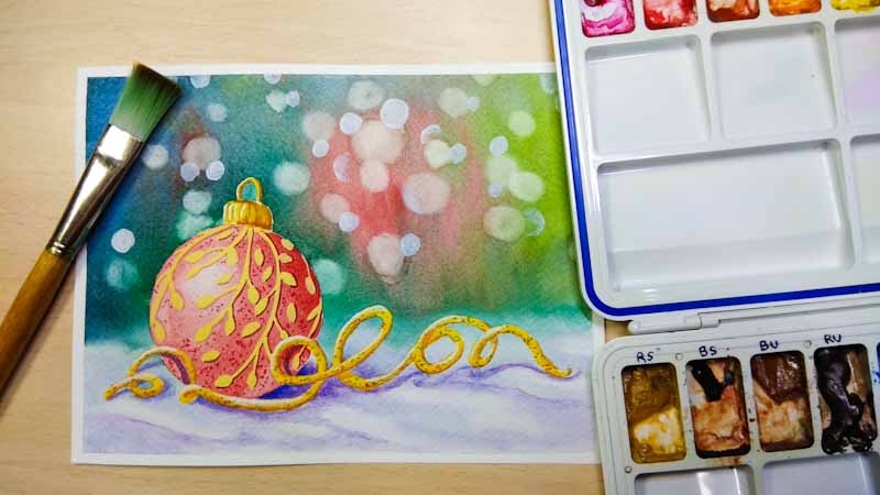
*Watercolor Painting (by Raju Dyapur) – The above painting shows cool colors and the mood of the cold/winter
How to Achieve Color Harmony?
Creating harmonious color schemes may seem intimidating at first, but with a little guidance and practice, you’ll get the hang of it! Here are some simple strategies to start with:
1. Use the Color Wheel
The color wheel is your best friend in understanding relationships between colors. Here are a few easy harmonies to try:
-
Complementary Colors: These are opposite on the color wheel (e.g., blue and orange). They create a vibrant contrast while maintaining balance.
-
Analogous Colors: These sit next to each other on the wheel (e.g., yellow, yellow-green, and green). They create a soft, harmonious look.
-
Triadic Colors: Form a triangle on the wheel (e.g., red, blue, and yellow). This creates a balanced yet dynamic scheme.

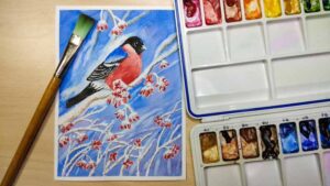
*Another watercolor painting (by Raju Dyapur). Can you look for the combinations?
2. Limit Your Palette
Begin with just 3–5 colors. This limitation helps you focus on creating unity rather than getting overwhelmed by too many options.
3. Consider Value and Saturation
Colors aren’t just about hue. Think about their lightness (value) and intensity (saturation). Mixing soft, muted tones with a few bright pops can bring balance.
4. Use Nature as Inspiration
Nature is the ultimate color harmonizer. Look at sunsets, forests, or ocean scenes to see how colors work together effortlessly.
5. Experiment with Tints, Shades, and Tones
Mixing white, black, or gray with colors can create variations that add depth and harmony to your painting.
Practice Exercise for Beginners
Here’s a simple exercise to try:
-
Choose a color scheme (e.g., analogous with blue, green, and teal).
-
Sketch a simple scene—maybe a landscape or still life.
-
Stick to your chosen palette and focus on blending and balancing the colors.
Final Thoughts
Color harmony is the foundation of visually stunning artwork. As a beginner, don’t stress about getting it perfect on your first try. The more you experiment and practice, the better you’ll understand how colors interact.
Remember: Every artist starts somewhere, and even the most accomplished painters were once beginners. Trust the process, and enjoy the journey of bringing your unique vision to life!
Happy painting! 🎨
If you would like to fast forward your learning using Acrylics OR Oil Pastels, check out some of the popular courses below