
Color mixing is a fundamental aspect of both art and design. Whether you’re blending paints, adjusting digital colors, or experimenting with light, understanding how colors interact is crucial. Among the various colors that can be mixed, purple and violet often cause confusion. Though they are sometimes used interchangeably, these two colors are distinct, both in their origin and in their appearance.
The Basics of Color Mixing
Before diving into the differences between purple and violet, let’s briefly review the basics of color mixing. Colors can be mixed in two primary ways:
- Additive Color Mixing: This method involves mixing colors of light. The primary colors in this model are red, green, and blue. When these colors are combined, they create white light. This is the method used in digital screens, stage lighting, and other technologies that rely on light.
- Subtractive Color Mixing: This method involves mixing pigments or dyes. The primary colors here are cyan, magenta, and yellow. When these pigments are combined, they absorb (subtract) certain wavelengths of light and reflect others, creating various colors. This is the method most commonly used in painting and printing.
The Origins of Purple and Violet
Now that we have a foundation in color mixing, let’s explore the origins of purple and violet:
- Violet: Violet is a spectral color, meaning it appears in the visible spectrum of light. It has a wavelength of approximately 380-450 nanometers, making it one of the shortest wavelengths of visible light. Violet is found at the end of the rainbow, between blue and ultraviolet (which is invisible to the human eye). Because it is a spectral color, violet cannot be created by mixing other colors; it exists purely as a wavelength of light.
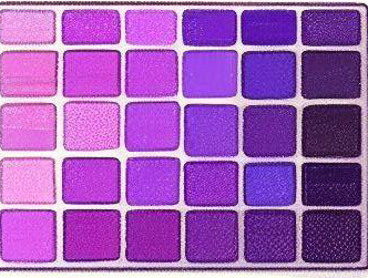
- Purple: Unlike violet, purple is not a spectral color. It does not appear in the visible spectrum and is instead a composite color. Purple is created by mixing red and blue pigments in subtractive color mixing. Depending on the proportions of red and blue used, purple can have a variety of shades, ranging from a bluish-purple to a reddish-purple.


Differences in Perception and Usage
Although purple and violet may look similar to the untrained eye, there are subtle differences in how they are perceived and used in art and design.
- Hue: Violet tends to have a bluer tone compared to purple, which often has a more reddish hue. This difference is especially noticeable when comparing the two colors side by side.
- Symbolism: In terms of cultural symbolism, violet is often associated with spirituality, mysticism, and introspection, due to its presence in the visible light spectrum’s higher-energy end. Purple, on the other hand, has long been associated with royalty, luxury, and power, stemming from the historical difficulty of producing purple dyes.
- Application in Art: Artists often use violet to convey a sense of calm or otherworldliness, while purple can be used to create a rich, opulent effect. In digital design, the difference between purple and violet can be more pronounced, especially when working with RGB values, where the blending of red and blue to create purple is more controllable.
Mixing Purple: Tips and Techniques
If you’re working with paint or digital colors and want to achieve the perfect purple, here are some tips:
- Start with Pure Pigments: To get a clean, vibrant purple, start with the purest red and blue pigments you have. Avoid reds with yellow undertones (like cadmium red) or blues with green undertones (like phthalo blue), as these can muddy your purple.
- Experiment with Proportions: Mix small amounts of red into your blue until you reach the desired shade. Remember that adding more red will push your purple towards a reddish hue, while adding more blue will create a cooler, bluish-purple.
- Use a Color Wheel: A color wheel can help you visualize the relationship between colors and ensure you’re mixing complementary hues that will enhance each other rather than dulling your purple.
- Consider Lighting: The appearance of purple can change dramatically under different lighting conditions. Natural light will bring out the nuances in your mix, while artificial light might make your purple look more saturated or muted.

Conclusion
Understanding the difference between purple and violet is crucial for artists, designers, and anyone interested in the nuances of color. While violet is a pure spectral color, purple is a composite color created by mixing red and blue. By mastering the art of color mixing, particularly when it comes to purple and violet, you can create more nuanced and effective color palettes in your work.
Happy mixing!
If you would like to fast forward your learning using Acrylics OR Oil Pastels, check out some of the popular courses below