Understanding the Color Wheel: A Key to Mastering Color Mixing
When it comes to painting, one of the most fundamental skills to master is color mixing. Whether you’re a seasoned artist or a beginner, having a strong grasp of the color wheel can significantly enhance your work. The color wheel isn’t just a tool; it’s a map that guides you through the complex and often confusing world of color theory. Here’s why understanding the color wheel is crucial for anyone looking to mix colors effectively.
The Basics of the Color Wheel
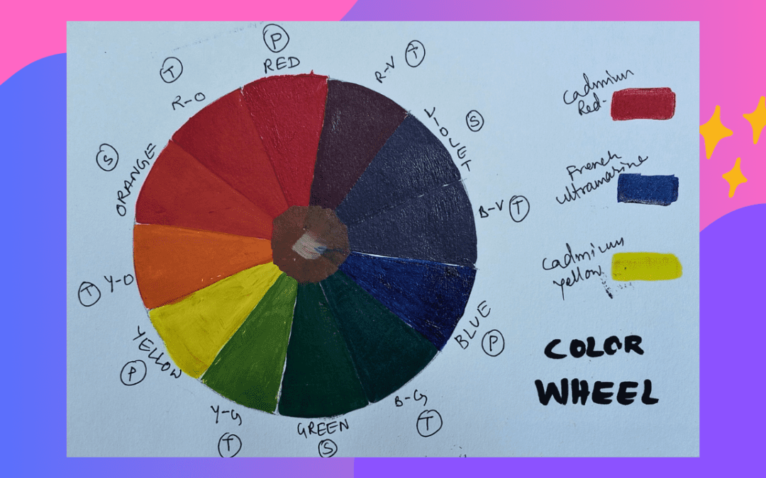
The color wheel is a circular diagram that represents the relationships between different colors. It is typically divided into 12 sections, each representing a specific color. The primary colors—red, blue, and yellow—are the foundation of the color wheel. These colors cannot be created by mixing other colors together. Secondary colors—green, orange, and purple—are formed by mixing two primary colors. Tertiary colors, which are blends of primary and secondary colors, fill out the rest of the wheel.
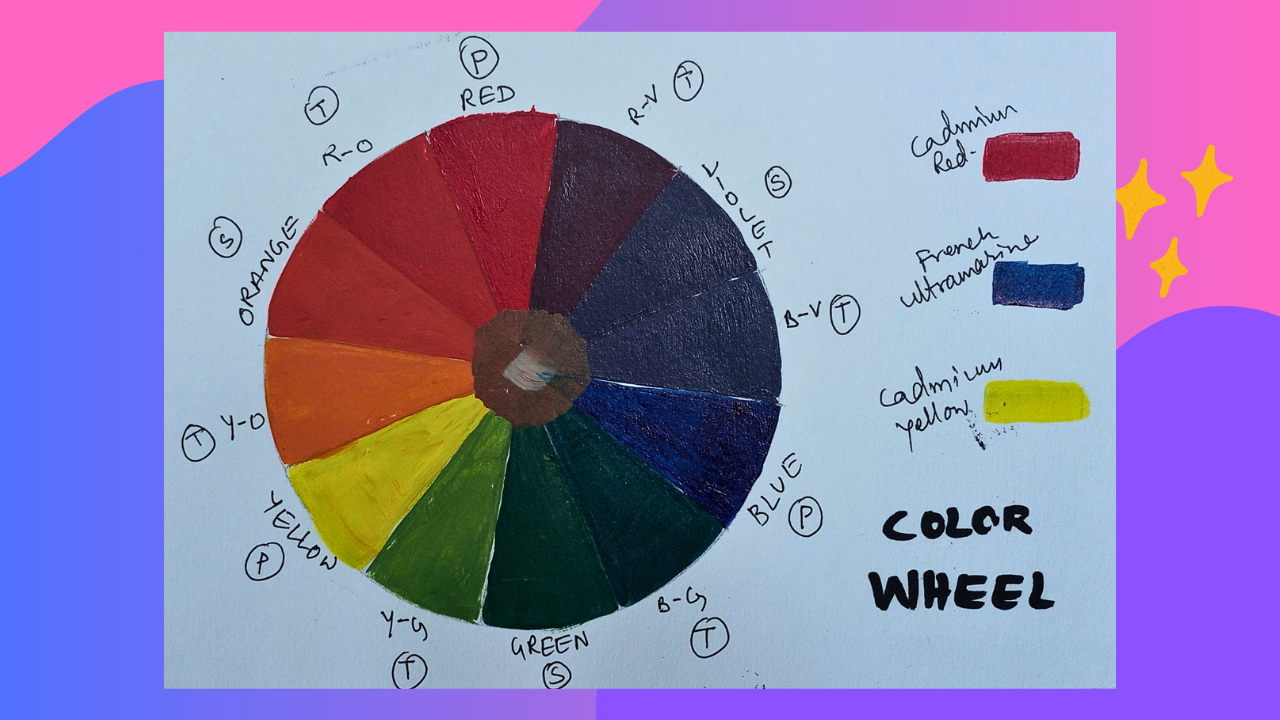
Creating Harmony with Complementary Colors
Complementary colors are directly opposite each other on the color wheel. When placed next to each other, they create a vibrant contrast that can make your artwork pop. When mixed together, they neutralize each other, creating browns and grays. Understanding this relationship is essential for creating balanced and harmonious compositions. For example, if you want a part of your painting to stand out, you might use complementary colors to draw the viewer’s eye.
Achieving Balance with Analogous Colors
Analogous colors are next to each other on the color wheel. These colors usually match well and create serene and comfortable designs. They are often found in nature and are harmonious and pleasing to the eye. When mixing analogous colors, you can achieve a smooth and cohesive look. This is particularly useful in landscape painting, where you might want to capture the subtle variations in color found in nature.
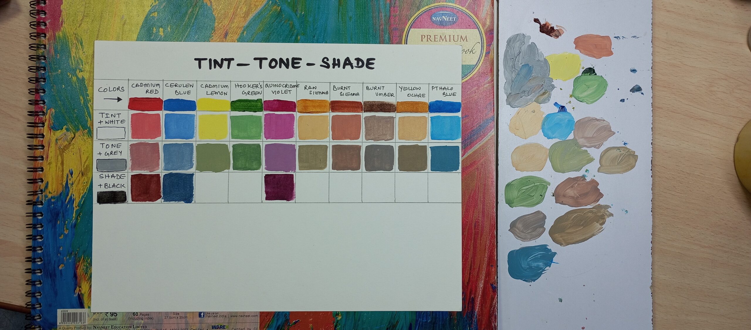
Mixing Tints, Shades, and Tones
Understanding the color wheel also helps in mixing tints, shades, and tones. A tint is created by adding white to a color, a shade by adding black, and a tone by adding gray. Knowing how to mix these variations can give depth and dimension to your paintings. It allows you to create a wide range of hues from a limited palette, making your work more versatile and dynamic.
Avoiding Muddy Colors
One of the common pitfalls in color mixing is creating muddy colors. This often happens when mixing complementary colors in the wrong proportions or when over-mixing colors. By understanding the color wheel, you can avoid these mistakes. You’ll know which colors to mix to achieve the desired hue without accidentally dulling your painting.
Enhancing Mood and Emotion
Colors have the power to convey mood and emotion in a painting. Warm colors (reds, oranges, yellows) can evoke feelings of warmth and energy, while cool colors (blues, greens, purples) can create a calming and soothing effect. By understanding the relationships between colors on the wheel, you can better control the emotional impact of your artwork. This can be particularly important in expressive or abstract painting, where color often plays a leading role in conveying the artist’s message.
Practical Applications
In practical terms, a solid understanding of the color wheel can save you time and materials. Instead of endlessly experimenting with different color combinations, you can rely on the principles of the color wheel to guide your choices. This efficiency can be especially beneficial in a fast-paced studio environment or when working on a deadline.
Conclusion
In conclusion, understanding the color wheel is not just important; it is essential for anyone serious about painting and color mixing. It provides a framework for creating harmonious and balanced compositions, helps in achieving the desired mood and emotion, and prevents common mistakes like muddy colors. By mastering the color wheel, you unlock a new level of creativity and control in your artwork, making your painting process more enjoyable and successful.
If you would like to fast forward your learning using Acrylics OR Oil Pastels, check out some of the popular courses below